PayVanza
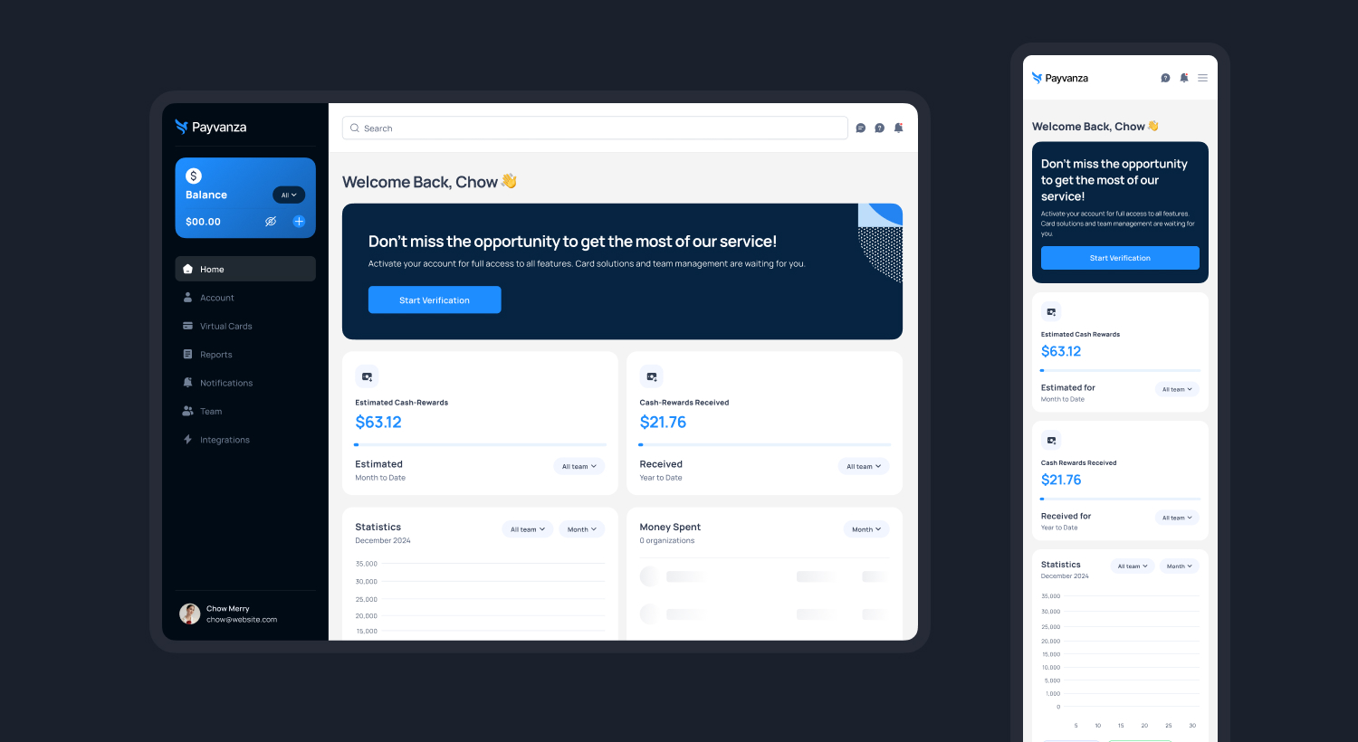
Payvanza is a mobile-first digital wallet and payment app designed to simplify how users send, receive, and manage money in everyday life. The goal of this project was to create a fast, secure, and easy-to-use financial experience for users who rely heavily on mobile transactions.
The Problem
Users were facing confusion with complex payment apps, slow transactions, unclear balances, and poor trust in digital wallets. Many apps were overloaded with features but failed at basic usability—making simple actions like sending money or checking transaction history frustrating.
The Goal
The main goal was to design a simple, secure, and fast payment experience that:
- Reduces steps to send or receive money
- Builds trust through transparency
- Works smoothly even for first-time users
- Feels modern, clean, and reliable
My Role
I worked as the UX/Product Designer, handling:
- User research
- User flows & wireframing
- UI design
- Prototyping
- Usability testing
Competitor Analysis
Users followed a think-aloud protocol, sharing real-time feedback during tasks. Post-test interviews were conducted to validate findings and measure confidence.
This research framework ensured that design decisions were grounded in real user behavior and system performance.
I studied popular digital wallet apps to understand:
- Their onboarding process
- Transfer flows
- Dashboard structures
- Trust and security indicators
- Transaction history layouts
Key Findings:
- Dashboards were overcrowded
- Payment actions were buried under menus
- Security messaging was often unclear
- Users felt uncertain after sending money
User Interviews
I interviewed frequent mobile payment users and discovered some key info.
User interview discovery:
- Users want to send money in 2–3 taps
- They want to see their balance instantly
- They need clear success and failure feedback
- They strongly care about security visibility
User Pain Points (Key Insights)
- “I don’t feel confident after sending money.”
- “Why do I need 5–6 steps to send a payment?”
- “My transaction history is hard to read.”
- “I don’t trust small wallet apps easily.”
- “The dashboard feels confusing.”
Design Strategy
The design focused on keeping the experience simple, fast, and trustworthy. A minimal UI removed all unnecessary clutter, while a clear hierarchy highlighted only the most important information first. Fast actions allowed users to complete payments in just a few taps. Trust was built into the design using clear confirmations and visible security cues. Simple language was used to make every step easy to understand for all users.
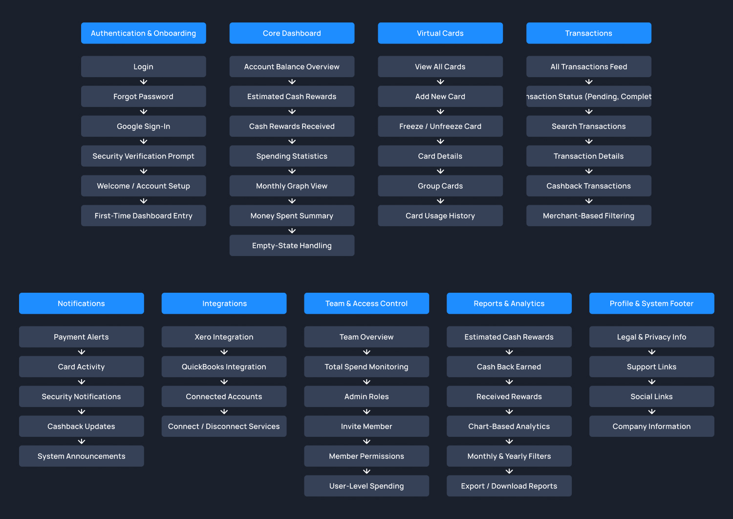
Information Architecture (IA)
The information architecture for Payvanza was structured to help users quickly understand their finances, take fast actions, and track transactions with clarity. The goal was to reduce cognitive load while maintaining access to advanced financial controls.
UI Direction, Testing & Final Outcome
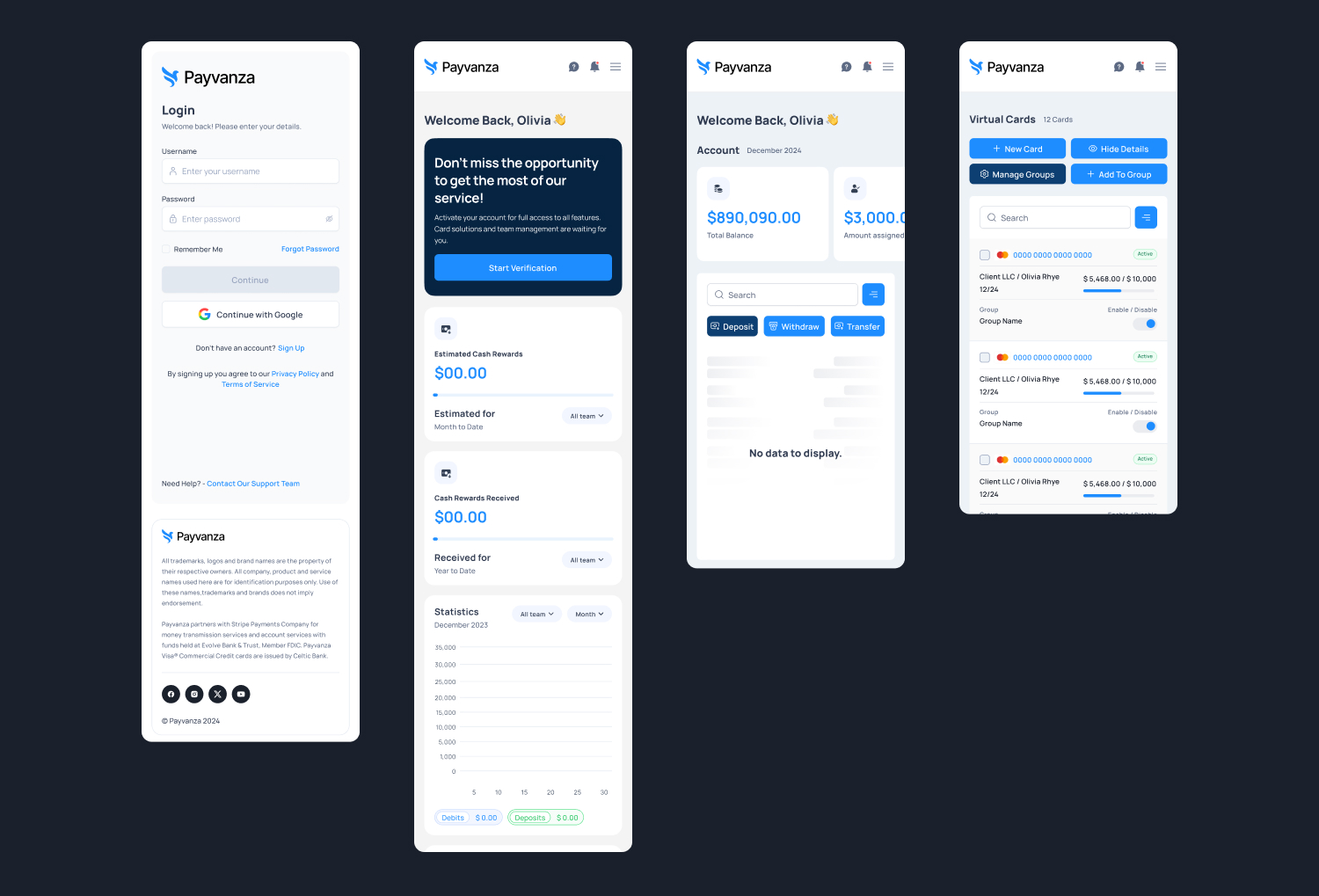
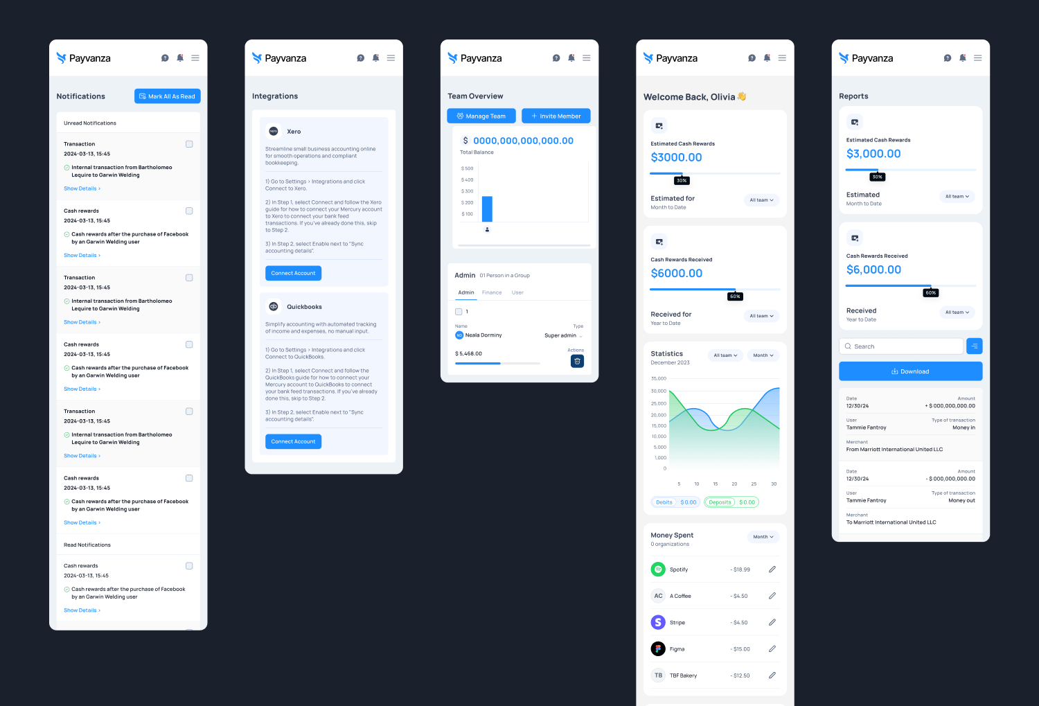
The Payvanza interface was designed with a soft neutral background, high-contrast text for better readability, a minimal icon set, large touch-friendly buttons, and clean spacing to create a stress-free experience. The overall goal was to make the app feel reliable, calm, and professional for everyday financial use.
Based on the testing feedback, button sizes were increased, confirmation messages were made clearer, error states were improved, and spacing was refined for better accessibility. As a result, the final design achieved faster transactions, fewer user mistakes, higher confidence during payments, stronger trust, and a clean, modern financial experience.
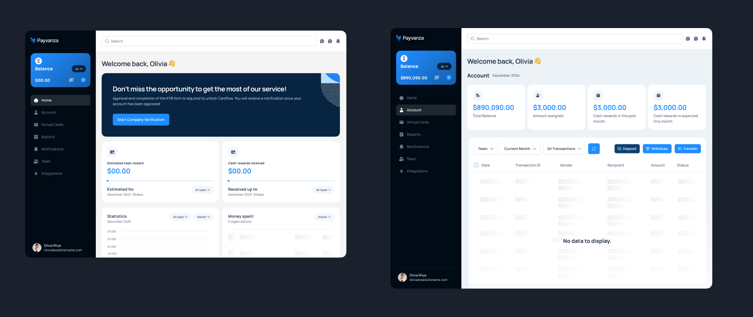
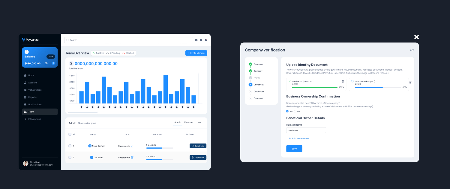
Desktop / Tablet preview.
Design System
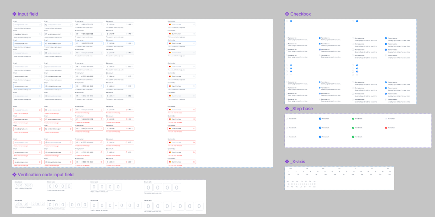
A scalable design system was created for Payvanza to ensure visual consistency and speed across all screens.
Great FinTech design is not just about transactions, it’s about trust.
One of the most rewarding parts of designing Payvanza was the opportunity to simplify something as emotionally sensitive as money. Throughout the research, design, and testing phases, every decision was guided by one simple question: Does this make the user feel more confident? By removing unnecessary steps, clarifying balance visibility, and strengthening confirmation and security feedback, Payvanza evolved into a product that feels calm, fast, and trustworthy